 |
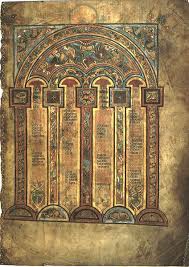
| Eusebian Canons from the Book of Kells |
 |
| Islamic Calligraphy |
As promised, I have put together a little post on calligraphy. Calligraphy is the art of beautiful writing. Most cultures with a form of written language have elevated portions of that writing to art. This goes beyond the idea of good penmanship, it is more than clear uniform writing, it allows creative presentation of the text to accentuate the message conveyed by its meaning. In this way it is different than the utilitarian writing; it is not an efficient conveyor of ideas, it is a fine art like sculpture or painting.
Different techniques are used to create a beautiful effect. For example the words themselves can form a picture or can be illuminated, this is a cool calligraphy word to describe adding color variation and illustration to the letters themselves or to the area around the letters (ok so this is the modern use of it there are more technical words to describe each process individually, technically illumination is just the gold or silver leafing, but it is used now to refer to the whole kit'n'kaboodle). A classic example of illumination is the Book of Kells from Ireland.
 |
| Mongolia Calligraphy |
Less extreme ornamentation includes elongating the ascenders or descenders the sticky up or hangy down parts of letters, into elaborate flourishes. Parts of the letters can also be decorated to form unusual shapes. This is most effective if it contributes to the tone of the written message. Ligatures are another way of adding artistitic flourish to text. There are some
standard ligatures but different artists tend to develop distinctive sets of combined letters. For example, I tend to loop my th and secondary l.
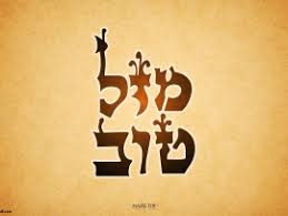 |
| Hebrew Calligraphy |
The artist can also vary the medium used. As I have made large calligraphic pieces I have noticed the difference between paper, vellum, parchment, and fabric. Each material catches the light differently and has a distinct affinity for different inks and pigments. Some inks are more transparent than others. A stronger piece usually calls for opaque ink on either a very smooth or very textured background, while a more lyric piece often employs fewer strong contrasts using a colored material and tinted inks. As the artists skill increases other media may be explored like metals.
 |
| Add caption |
 |
| Islamic Calligraphy |
Modern calligraphy tends to be more organic in its construction, ignoring typical literary and typological conventions.
 |
| Armenian Calligraphy |
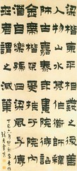 |
Chinese Calligraphy
Jin Nong 1200 |
Because this is my post, I will now subject you to some samples of my own work.
 |
My standard handwriting.
Very efficient and very ugly |
 |
A piece of Calligraphy
Not at all efficient but a vast improvement over my normal script |


Hurrah for Arabic calligraphy! I love it! (Real comment later, I promise.)
ReplyDeleteWow, very cool! I never really thought about words being elongated or put together to form a picture as part of calligraphy. I totally, see why though, it adds to the appeal and makes the written language more aesthetically pleasing.
ReplyDelete