Tuesday, November 29, 2011

The Renaissance of font design


Shockingly, I decided to blog about fonts again. Fonts are so simple, we interact with them on a daily basis and yet they are also intricate pieces of art and vitally important in the clear presentation and dissemination of knowledge. I really have become obsessed with fonts as of late. This can probably be attributed to the fact that I am working at a graphic design firm and am surrounded by people who appreciate the subtle art of font design. 

The Renaissance marked an influx of secular knowledge with the movement known as humanism. Scholars in during this period of time turned to the ancient wells of knowledge from the Greeks and Romans. With this new wave of secular information new more legible, clear, simple and secular fonts were required. It was the first time in the history of typography where artisans looked to the past to influence their font designs. Latin and Greek culture and art heavily influenced the type design masters of this era. Improvements in the actual printing methods and machines brought new inventions within the typography realm. Designers were starting to introduce ideas of wider margins and clean typesetting. The Renaissance truly influenced all areas and aspects of life and learning; font design not excluded. 


page from Aldus Manutius' book on Aristotle
all Aldine books bear his logo
The first person I would like to highlight in my exploration of Renaissance font design is Aldus Manutius  (1450–1515). Aldus was a humanistic scholar that through his tutoring of the wealthy Pio family acquired his own printery in Venice. From this printery he published Greek and Roman classics, including a five-volume set on the works of Aristotle. One of his main focuses was to print small format books at low cost to scholars. His biggest contribution to the world of type was that he designed the first Greek alphabet typesetting. He also invented a space saving Latin font based off Italian cursive fonts. All his books (called Aldine books) bear his logo of a dolphin and an anchor and a dolphin.


Granjon, designed by Robert Granjon is considered
to be the closest typeface to the original Garamond


Adobe Garamond font
 The differences in the two fonts above are very subtle.
Can you find them?


Claude Garamond (1480–1561) was a Parisian publisher and font designers. He was one of the most famous type designers of his time. I mentioned this in my bibliography post. I mentioned in my post that his work is so famous that it is still in use today and that Harry Potter was printed using Adobe Garamond. He first gained popularity in 1541 when three of his Greek typefaces were used in a royal book by Robert Estienne. His inspiration for these three fonts came from the handwriting of Angelo Vergecio, the King's librarian at Fontainebleau, and his ten-year-old pupil, Henri Estienne. His influence spread beyond France with his Roman typesettings that followed in the 1540s. His work is still considered to be among the finest within the realm of typography. 


from Troy's famous work Champ Fluery

The last person that deserves attention is Geoffroy Tory (1480-1533). He was one of the prominant  printers of Paris during the beginning of the sixteenth century. His most famous work is the the theoretical treatise on the design of Roman capital letters in 1529. Tory followed the common practice of the day of finding relationships between the proportions of type and the shape of the human body. Thus Tory was known for drafting letters with geometrical aids to better analyze their resemblance to the human body.

Thus concludes my brief examination of the Renaissance of font design with a look at three prominent designers and their individual influence on typography. Thank you for everyone bearing with me as I explore a particular branch of knowledge that frankly I love. I think it is so interesting how we often disregard the subtle beauty and pure art involved with typography. We are surrounded by type everyday and yet we don't actually pay attention to it. How can something be in our face but we don't truly see it?

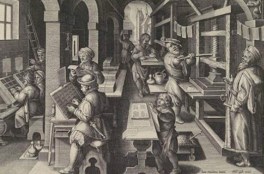


The Story of the Dictionary (and my discovery of it)

The English Dictionary is the second most purchased and most used book behind the Bible only.  Of course, there isn't just one dictionary or version of it, just like there are multiple versions of the Bible.  Nevertheless, it is a popular book.  But as one renown dictionary maker (also known as a lexicographer) said, it is meant to be browsed in, not read cover to cover. 

There are several parts of language, and one of them is the actual words that are used, the vocabulary or the lexicon of a language.  This is what a dictionary is meant to help with at its fundamental level: allow people to understand the lexicon of the language.  That is why the first dictionaries were what we would call translation dictionaries and have two different languages in them, usually comparing Latin to some other language.  Later the idea developed to define the vocabulary of one language, creating monolingual dictionaries.  Then the development of ordering a dictionary in alphabetical order was introduced by Englishman Robert Cawdery, which became such an intrinsic part of dictionaries that books that don't do anything similar to a dictionary (define the lexicon) have acquired the title because of the alphabetical listing of their entries.  Then, finally there was the idea of an American dictionary, because our version of English was different from the British, and that's how Merriam-Webster became a household name. 

But really, you don't want to hear the story of the dictionary.  You would much rather hear about my story in the library finding out about dictionaries.  I dislike the fact that we have to put our annotated bibliography in alphabetical order, because that doesn't fit the order of the story, so I have numbered them in chronological order if you want a continuous story of discovery. 


Monday, November 28, 2011

Annotated Bibliography: Censorship in Elizabethan England


            For my annotated bibliography assignment, I decided to learn a little bit about censorship in Elizabethan England. Censorship is a topic that I’m very interested in, but it’s such a huge topic that I wouldn’t have known where to start if I was just researching anything to do with it, so I wanted to narrow it down somehow. The Tudors made for some of my favorite English royal drama, Elizabeth I is one of my favorite people, and Shakespeare was producing his work during the Elizabethan and Jacobean (Stuart) Eras, so I decided to learn everything I could about censorship in the Elizabethan Era. There weren’t very many books on that specific topic, but I was able to find several books in the library in which the issue was at least addressed on some level, and I used interlibrary loan to have a few other books sent over.

Print Distribution and Dissemination.

As you can tell from my previous blog posts, I am intrigued by the idea of printing and how it affected society today. I'm grateful that Johannes Gutenberg invented the printing press during the Renaissance Era, because it changed how people back then and even still today receive and distribute knowledge. Without it, the education system, the legal system and many other aspects of society today would be completely different and would most likely be more oral based and involve a great deal of memorization.

To show my appreciation for print, distribution and dissemination during the Reniassance Era, I decided to do some investigating on this subject. I searched the Harold B. Lee Library and made my way to the fifth floor to scope out some books on the topic.


Visiting the Crandall Historical Printing Museum


A few weeks ago, I rode my bike down to the Crandall Historical Printing Museum. It wasn’t my first visit to the museum, but in fulfilling the “field trip” requirement for our class unit on printing, I decided to go back. I thought it would be interesting to see what my impressions of the museum were this time around. Here are a few of the thoughts I left with:

Thursday, November 24, 2011

Print and its Effects on Medical Advances

(So according to some suggestions by our professor I'm adding this note.  This post is part of my ANNOTATED BIBLIOGRAPHY assignment.  The bibliography is below the page break and is about THE EFFECTS OF PRINT ON MEDICAL KNOWLEDGE.)

*     *     *

Venturing into the strange world physical research in a library with actual books, moving bookshelves, and code-like numbers on the sides of these books can be a pretty scary task for today's college student.  I probably do about one or two research assignments in the library each semester, but I swear that each time a have I have to again overcome my fear of doing research and actual physical movement at once.  I also have to relearn how to look stuff up there every time I try to use the numbering system, which reminds me of the library card song from Arthur - An integral part of my childhood.  Please enjoy:


"Who's Dewey?": one of those questions we will never know the answer to. . . or maybe we could look him up on wikipedia.  Anyway, after getting reacquainted with the cataloguing system again, (which is actually not the Dewey Decimal System in the HBLL) I started to search for books that teach about how the printing press affected medicine.  So here it is:

Tuesday, November 22, 2011

Typography


So first of all I would like to apologize for not getting this post up yesterday. I can of had an emergency yesterday in which I got stuck on a cliff/mountain up Rock Canyon with my roommate and my cousin for the better portion of the day. Needless to say I forgot to bring my computer and the HBLL with me so I didn't get this post up yesterday.


It probably came to no ones surprise that I chose to do my bibliographical post on exploring the different typefaces and fonts that were popular between the years 1450-1700. I love everything design oriented and since interning at Vada Creative Studio I have come to really appreciate the beauty and intricacies of typography. Wikipedia defines typography as: [coming] (from the Greek words τύπος(typos) = form and γραφή(graphy) = writing) is the art and technique of arranging type in order to make language visible. The arrangement of type involves the selection of typefacespoint sizeline lengthleading (line spacing), adjusting the spaces between groups of letters (tracking) and adjusting the space between pairs of letters (kerning). Additionally, I must admit that this post really stretched me, I am much more comfortable to researching online. I read physical books, but mostly for pleasure. So, it was quite an experience to actually dust off the pages of some good ol regular books. It was also pretty distracting I found myself browsing through many books on typography even though I knew I wouldn't be able to use them in my post because they were too modern. I guess that is the beauty of self directed learning- getting lost in the knowledge of what you love...